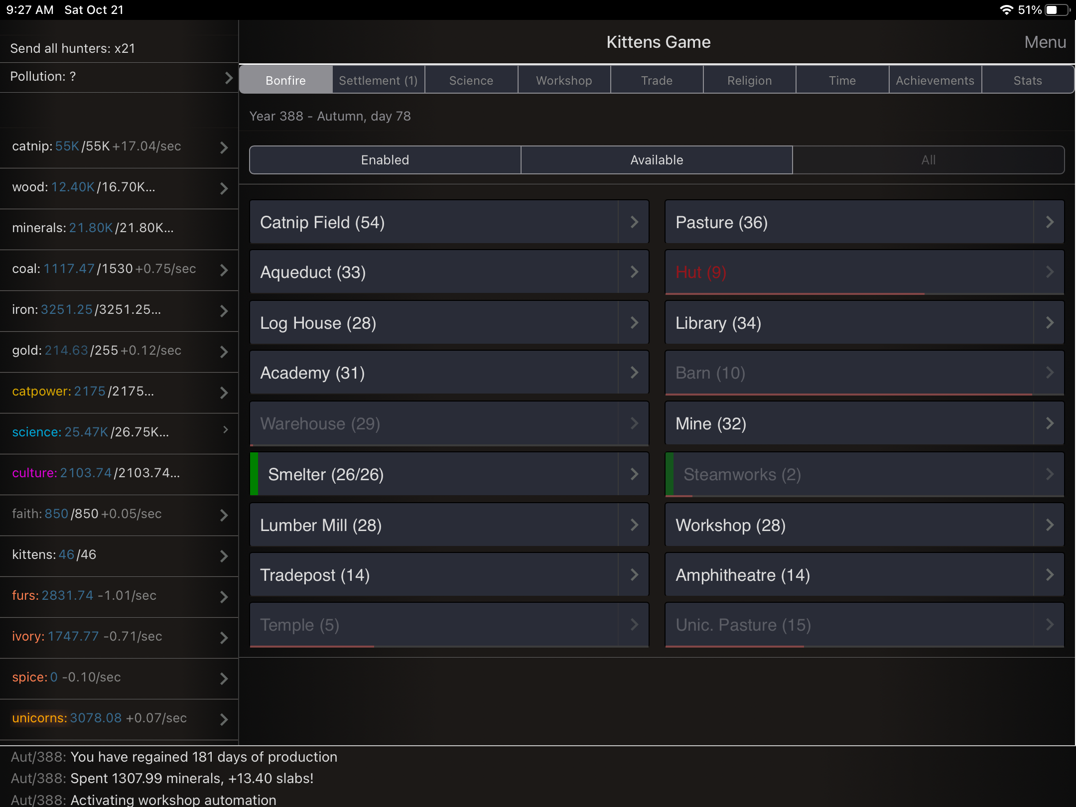
A suggestion—I find it hard to see all the relevant info in the left pane due to all the sig figs, even using the low precision option. The production rate is not visible for all the resources. The attached pic uses normal font size with the Inverted theme. It seems unnecessary to show 2 decimal places for resources that are measured in the thousands and fewer decimals would free up more space in that pane.
Alternatively, the left pane could be made wider to accommodate. The right pane seems wider than necessary—there is a lot of empty space on the buttons and descriptions, so I think that pane could be somewhat narrower.
A third option could be to have an option of a 2 or 3 character abbreviation of the resources to free up some space. We who have been playing a long time know them by their position and color mainly.
Thoughts?
General
!kittensgame- 0 users online
- 1 user / day
- 3 users / week
- 4 users / month
- 4 users / 6 months
- 16 subscribers
- 1.07K Posts
- 6.33K Comments
- Modlog
- mods:
- AI Core
- @bloodrizer
Ok, both are fair notes, sidebar width is probably the easiest to increase on ipad layout. What is your current device model and screen resolution for the reference?
8th gen IPad (non-air). Resolution is 2160x1620. Thanks!
UPD: should be live on latest android beta
I have increased column width to 300px for 1020px+ resolution, should be in the next update soon-ish.